SVG in React
React.js simplifies creating UI components, including inline SVGs. With the DOM supporting SVG, React lets you directly output SVG elements, allowing dynamic updates via props and state.

React.js is a great library for creating user interfaces consisting of components. In the browser React is used to output DOM elements like divs, sections and.. SVG! The DOM supports SVG elements, so there is nothing stopping us from outputting it inline directly with React. This allows for easy creation of SVG components that are updated with props and state just like any other component.
Even though a lot is possible with plain CSS, creating complex shapes like hearts or elephants is very difficult and requires a lot of code. This is because you are restricted to a limited set of primitive shapes that you have to combine to create more complex ones. SVG on the other hand is an image format and allows you a lot more flexibility in creating custom paths. This makes it much easier to create complex shapes as you are free to create any shape you want. If you need convincing, checkout these slides from Sara Soueidan’s great talk about SVG UI components.
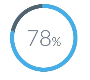
At Etleap we have used React with SVG output in some of our graphical components. A great example of this is our circular progress bar.

Circular progress bar used on our dashboard.
This component uses SVG to display the circular progress bar and works just like any other React component. It accepts a few props, including the percentage value to display, and updates whenever new props are received. The reason we opted for SVG in this case was that creating a circular progress bar in CSS is tricky. Using SVG for this was much more appropriate and was straight forward using React to output the SVG markup directly to the DOM, let’s compare the two approaches.
The essential SVG markup required to render the progress bar is very simple:
We need two circles, one for the dark background, and one for the lighter progress display. The circles are transparent, and the stroke of the circles show the progress and background. To show the amount of progress we use a dashed outline for the circle. If the space between the first and second dash is at least the length of the circumference of the circle only one dash will be shown and we can manipulate the length of that dash to show the current progress. We use stroke-dasharray to specify the length and distance between each dash and stroke-linecap: round to get rounded ends.
Let’s have a look at how we can create a similar progress bar in CSS:
Since CSS does not support stroke-dasharray, nor stroke-linecap, we are immediately at a disadvantage, therefore lets simplify the problem and start by creating a pie-chart. We create two circles here as well, one for the background and one for the progress bar. To display progress we need to be able to cut away part of the circle, so that we are left with a pie slice. To make this happen we can use the CSS clip property (unfortunately it has been deprecated, and the replacement clip-path has very poor browser support). This enables us to define a rectangle mask for the circle so that we can hide parts of it. The problem is that this only works for a maximum of 50% at a time, so we actually need two of these, one for the right and one for the left… As you can see; this is already getting pretty complicated, and we have not even looked at how to handle the rounded edges. So to prevent doubling the length of this post we’ll stop here. If you are interested in the full solution (without rounded edges) checkout this post by Anders Ingemann.
SVG should not be a replacement for all graphical user elements, but can be used to more easily achieve tricky UI effects where CSS falls short. The most important difference is that SVG supports custom paths. This means you can create any complex shape you want and easily display it, or use it as a mask. This is especially relevant in scenarios involving charts or line drawings. Other interesting features that CSS is lacking includes drawing text along a path, animating paths, and support for a bunch of filters. That being said, CSS is catching up with SVG and has seen support for several filters, masks, and even custom clip paths. For now though, if your designer has created some truly fancy UI effect that you instinctually disregard as impossible, perhaps it is a good time to look into SVG and make it a reality after all.